Thirty Flights of Loving blew me away when I first played it. I knew instantly that I had to write about it, and I felt sure I’d only have good things to say. Well, after sitting on it for a while and talking to others about it, I’m not exactly raving anymore. I had a similar experience with Bioshock Infinite, so I guess it’s a good thing I write slow enough to allow myself time for digestion.
First, let’s talk about the good, get that out of the way. Obviously, the use of cuts in TFoL is incredible and innovative, as is the non-chronological storyline. Especially impressive to me was its confidence in leaving major plot points off-screen and the way it only hinted at the order of events. It took me several playthroughs to notice Anita’s fake leg, and it wasn’t until then that I was able to piece the story together. It’s not often that a game trusts its players enough to leave something so important so vague, but this trust makes room for stories with more depth and subtlety. In addition, it allows non-explicit components of the game to become important. Much value can be found in TFoL just by looking more carefully.
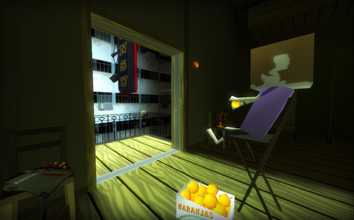
Also worthy of praise are TFoL’s sense of style, both visually and narratively, and its general attitude. TFoL has a strong, sculptural feel to its world, and goes out of its way to make dramatic use of color. There’s a major use especially of stunningly hot oranges and pinks between more neutral, lighter cool colors. (The orange especially feels important and central to the game, tied together as it is with the quietest, most thoughtful scene in the game—eating oranges with Anita in the apartment.) There is some messiness and, in my opinion, general failure with color, especially in the busy airport scenes, where color is mostly used obviously and perhaps without much thought. But as a whole the heat of the game gives it a lot of attitude, and this attitude is mirrored by the fast pace of movement through spaces, the quick cuts (well, quick for games anyways), and the jazzy music.
But TFoL does have its problems. I found the game intuitive and compelling throughout, but, frustratingly, this was not true for a single other person I showed it to. For some, I think it was a lack of comfort and knowledge with the FPS genre that led to their confusion. For others, it was a preponderance of comfort—they weren’t really looking, because they’d been trained not to. In general, there was an expectation for something gamier, less controlled, and more explicit.
This raises a question: is it a failure for a work of art if it only a fraction of its potential audience ‘gets it’? I don’t think so, but games like this, games that emulate movies, might be a special case. Confused players of TFoL have enough control to actually throw the pacing off, to focus the screen on irrelevant objects, to disrupt the story trying to be told. This is something that can’t really happen with movies. It’s not only that the narrative of the game was missed or unappreciated, but that the literal play narrative was way off from what the designer (seems to have) intended, and without that designed narrative the game has little to offer. Much of the narrative became about what that weird orange sphere was doing in your hand and how it got there; a lot of time was spent walking up and down stairs during the wedding wondering where the hell your friends went; important character introductions were completely missed. It’s worth considering that for many players, lacking the context to play this game ‘correctly’ meant not even being able to really see what was there. Maybe it would be more powerful as a film, taking the burden of control away from the player and giving them the ability to actually see the story. Maybe not. But it’s kind of scary even having to ask that question.

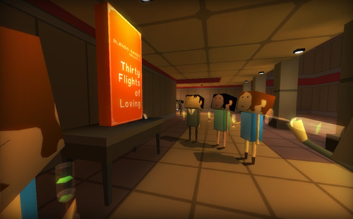
In my opinion, the real failure of TFoL is its final inability to take itself seriously. I’m talking specifically about the last scene of the game, which presents objects from the game in a gallery setting, making an awkward, self-effacing joke, a jab at the fact that the game aspires to be worth considering on the same level as art. Really? You were so close. So close to seeming like you weren’t ashamed of trying to make a Good game. On top of this, there’s the use of the gallery setting to relate a valuable and interesting metaphor for the game’s events—Bernoulli’s Principle. I love this metaphor, and I think it provides a wealth of depth to the game. But did it have to be presented in this self-shaming context? Why can’t we use metaphors in games without feeling embarrassed about it?
TL;DR—Thirty Flights of Loving is innovative, interesting, and rife with attitude. It might suffer from its interactivity. It does suffer from its self-effacing irony.
September 29, 2013